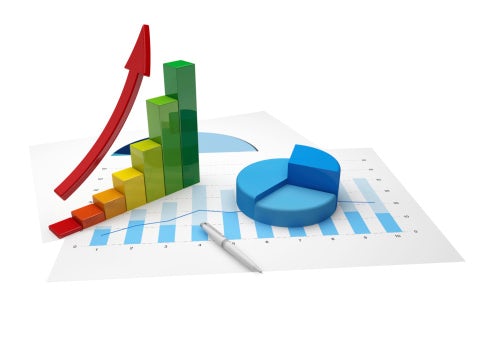
Is visualization the key to proper use of big data? Bar charts, treemaps, scatter plots – these are all visualization tools that put data into perspective, but do they drive the point home for those looking to extract meaningful information? The answer is to create a multidimensional view of the data that is more intuitive. This approach is Interactive Visualization.
What is Interactive Visualization?
Interactive Visualization takes the data and presents it in a variety of ways. It enables users to create an interactive approach that enhances traditional data exploration.
- Heat maps
- Link charts
- Geographic maps
The customized combination offered by Interactive Visualization makes the presentation pop. All of the processes link to the underlying data.
Putting the Program to Use
Interactive Visualization offers a real-time view of operational and tactical data. For example, consider on-the-road invoice generation. Let’s say in one hour, a sales representative creates 10 invoices while on the road. This information alone doesn’t offer much to the viewer. It is not until you break down the data into actionable intelligence that trends begin to appear.
- This individual produced 50 percent more invoices this month on this route than were produced in the previous month.
This fact forces the users to ask questions some questions. Increasing the available metrics answers those questions.
- Was the sales rep able to visit more customers?
- Did he or she sign new clients?
- Is one product selling more than the others?
- Is there an increase in one specific geographic location?
- What is the average price per invoice?
Once you start asking questions and narrowing down the data to answer them, you can put that information to work.
With Interactive Visualization, the user looks at contextual data, assigns key metrics points to it and uses that information to make decisions that matter.
Key Properties that Make Interactive Visualization More Effective
- Easy to use interface – Even a novice user can find ways to manipulate the presentation and get the most from the data break down.
- Architecture that drives the process – Interactive Visualization pushes the process forward in real time by working in phases. For example, typically at the completion of each phase, real-time information shows up in green to highlight the changes.
- Digestible interactive patterns – Users select data and filters that highlight the perspective to find actionable key points. The presentation inspires the users to manage hot spots and establish trends that lead to change.
Intuitive presentation is the key to making big data work for you. With Interactive Visualization, companies manipulate data findings in a way the offers powerful information and provide predictive analysis to point to the most production path.
Search
Subscribe
Latest Posts
Posts by Category
Our choice of Chrome River EXPENSE was made in part due to the very user-friendly interface, easy configurability, and the clear commitment to impactful customer service – all aspects in which Chrome River was the clear winner. While Chrome River is not as large as some of the other vendors we considered, we found that to be a benefit and our due diligence showed that it could support us as well as any large players in the space, along with a personalized level of customer care.
We are excited to be able to enforce much more stringent compliance to our expense guidelines and significantly enhance our expense reporting and analytics. By automating these processes, we will be able to free up AP time formerly spent on manual administrative tasks, and enhance the role by being much more strategic.